BRAND IDENTITY PROCESS
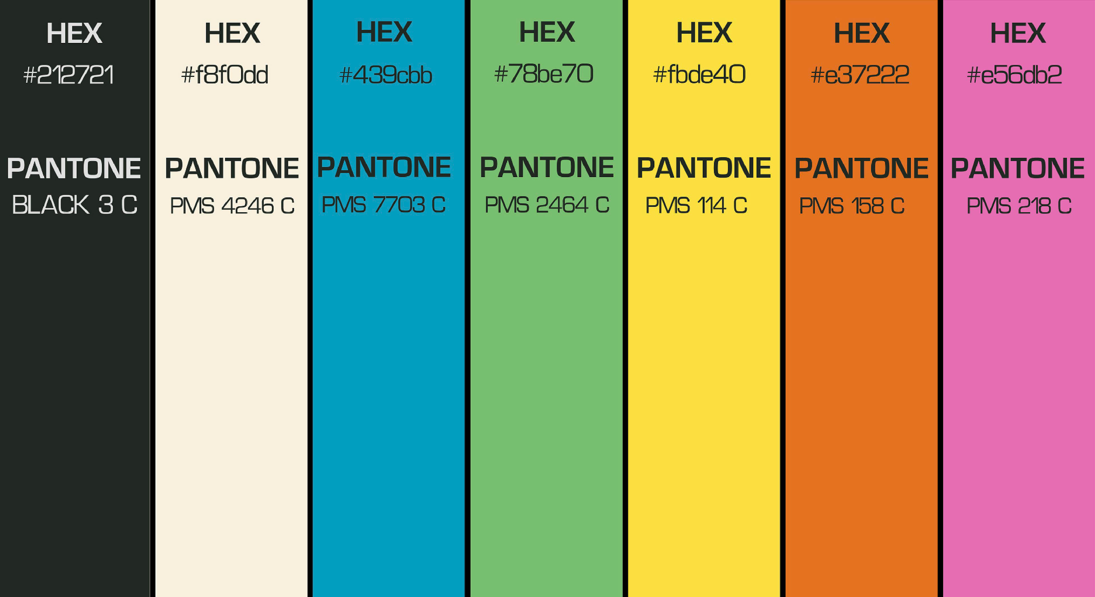
The color Palette:
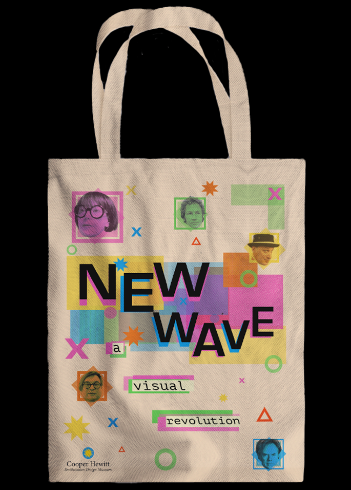
While picking out colors to represent the New Wave Era, I wanted to make sure each color was able to pop out and grab attention.
Similar to how Greiman's work in the 80's was deemed "shocking", and in no way prudent.
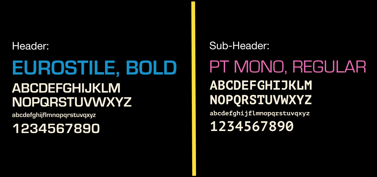
TYPOGRAPHY:
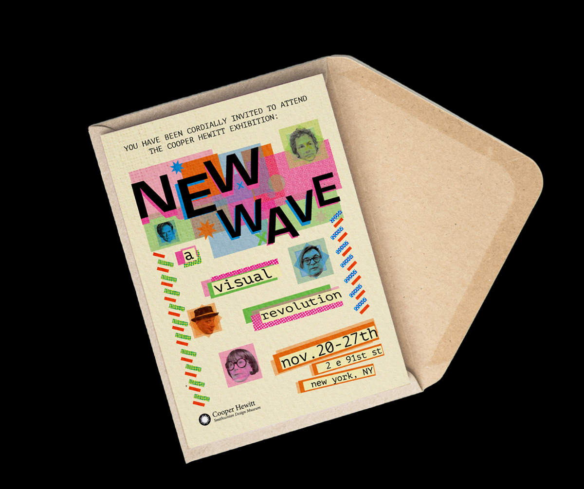
The New Wave Era signified a renaissance in Graphic Design.
Introducing technology to design was new and unheard of in the 80's, and I chose to go with a typeface that would visually reflect this curiosity.
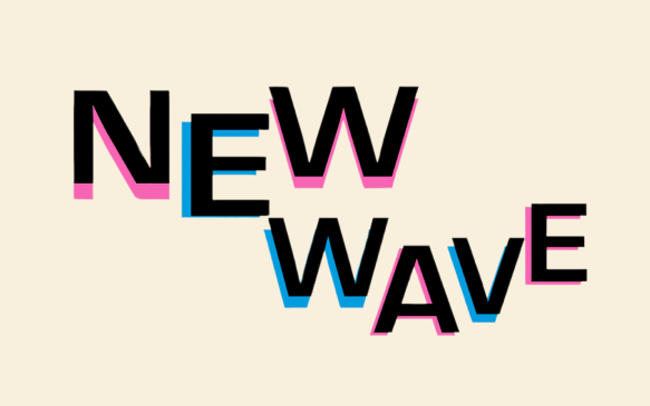
THE LOGO:
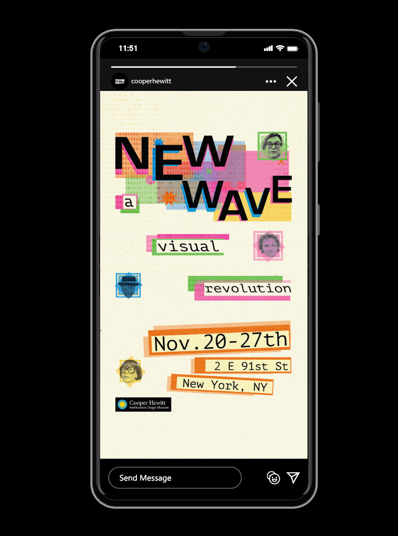
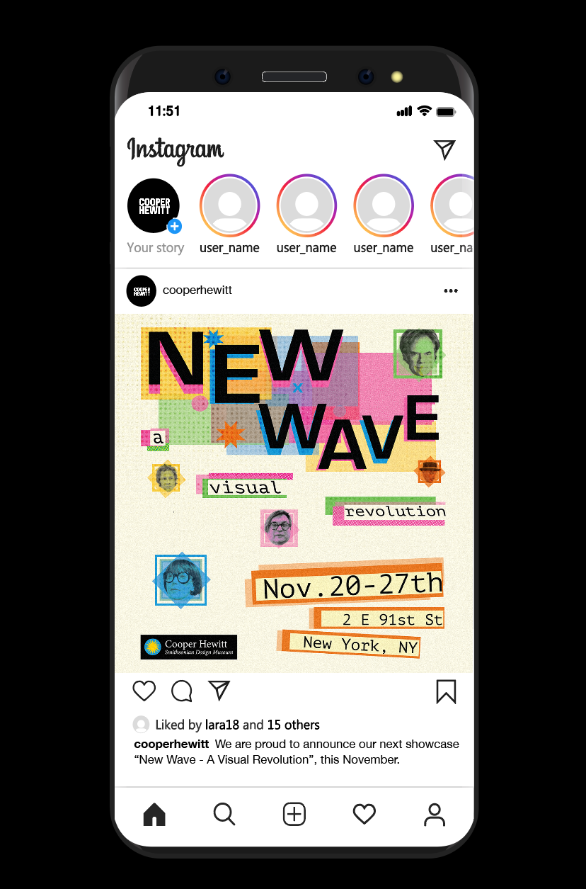
While creating this logo, I was inspired by Greiman's experimental usage of type, perspective, and layering throughout her career. Additionally, I chose to place each letter in a way that would make the logo appear as though it is moving in a wave-like motion.
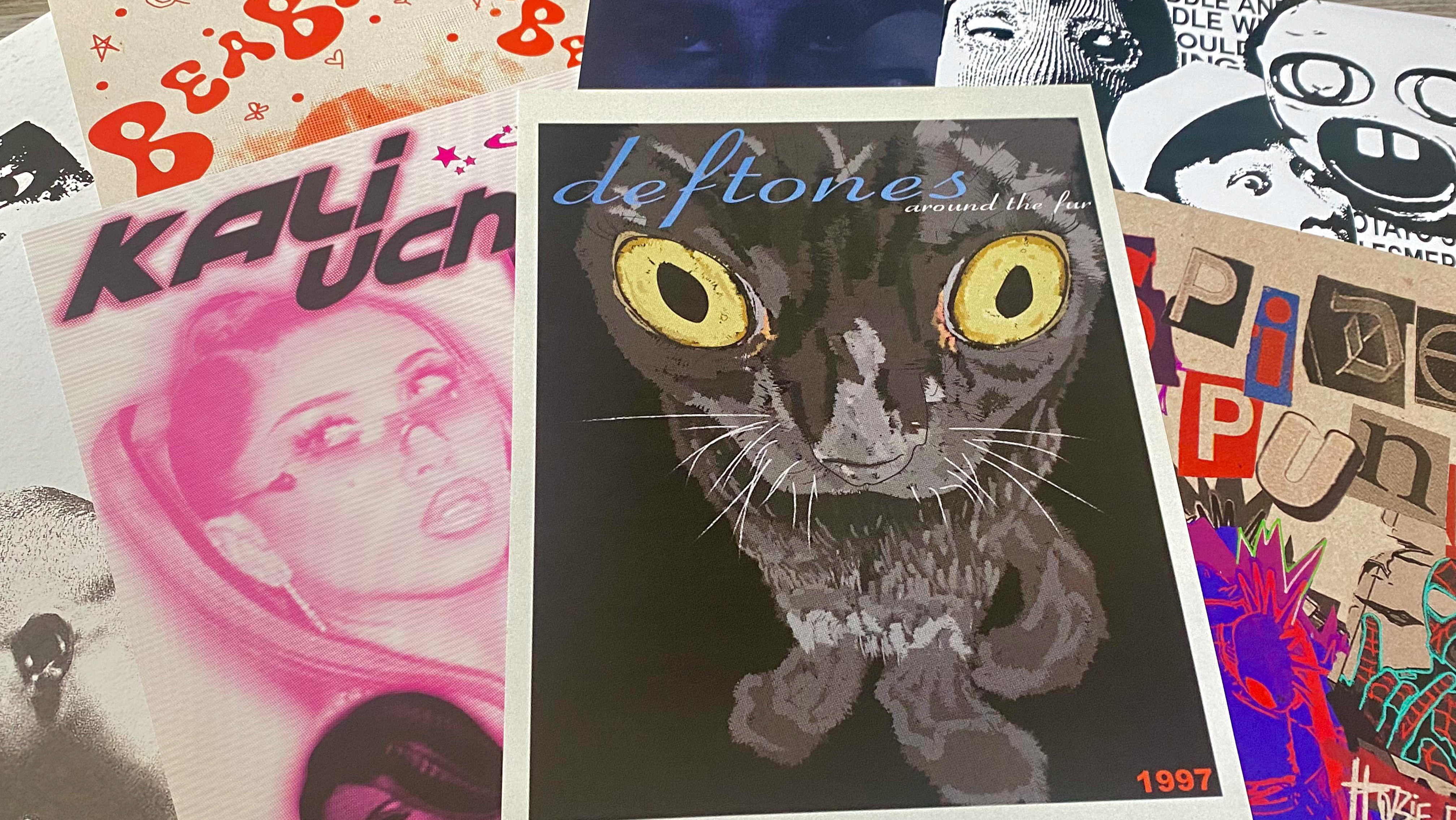
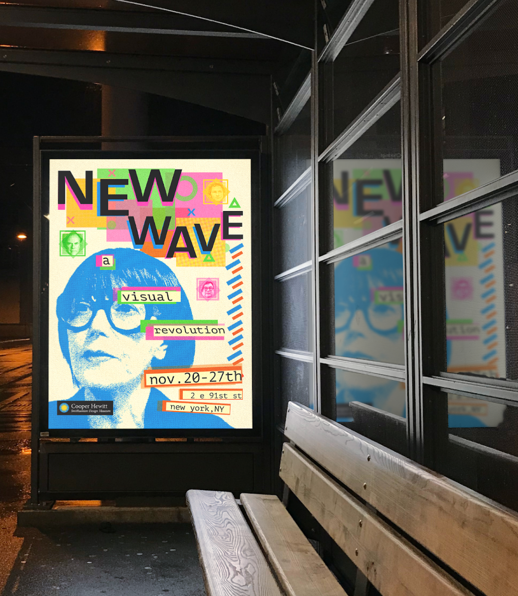
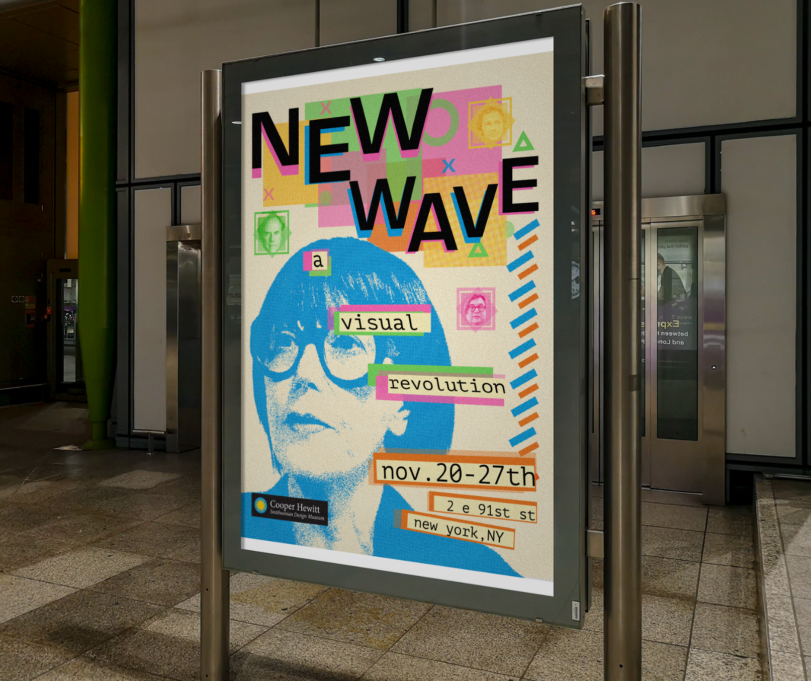
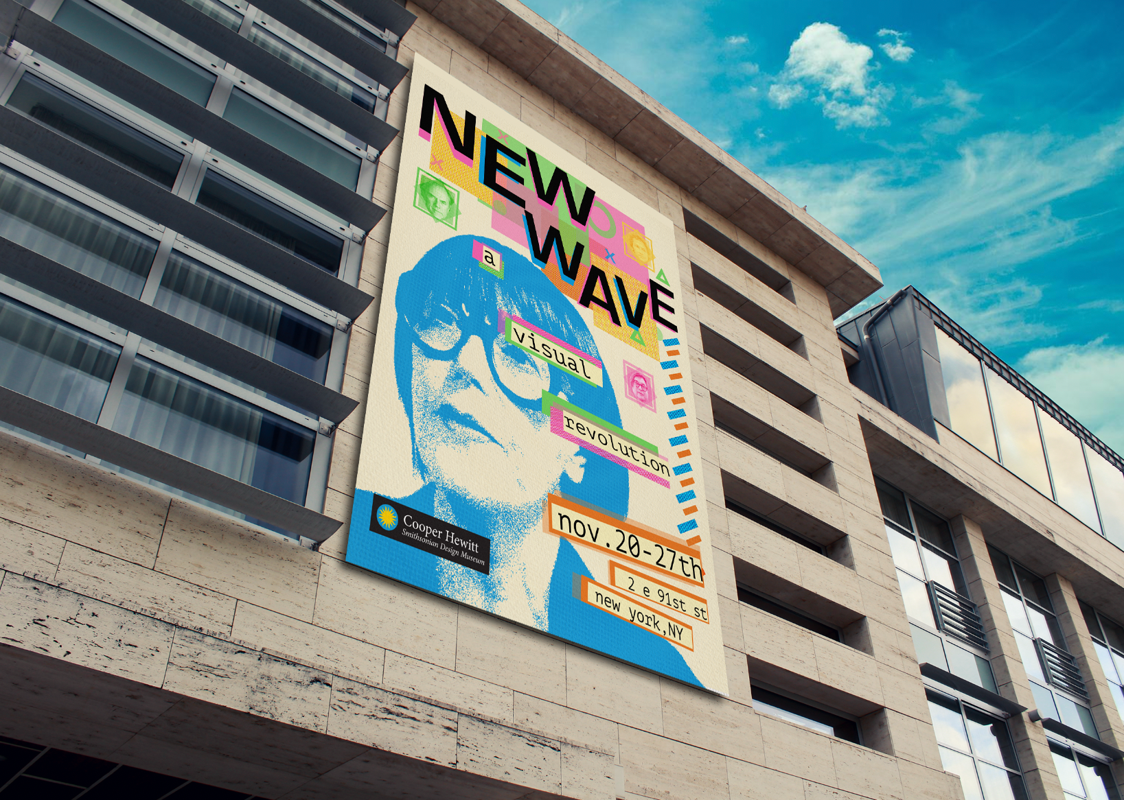
PROMOTIONAL POSTER
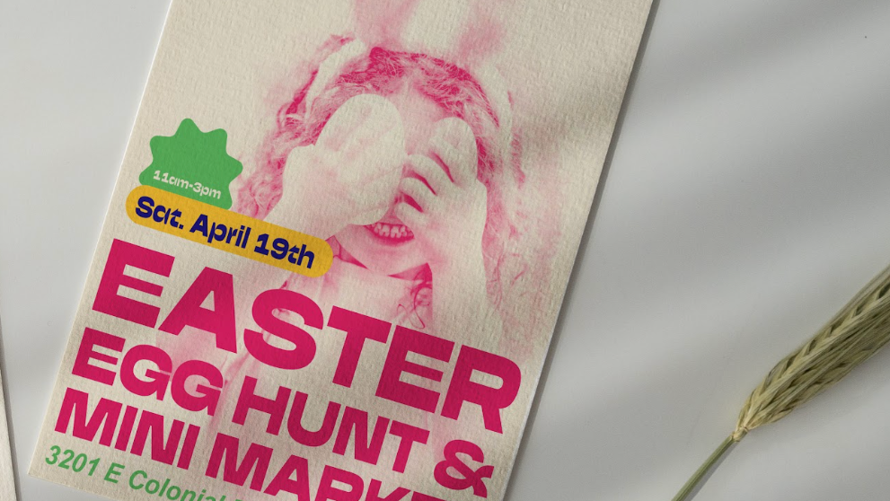
INVITATION
SOCIAL MEDIA
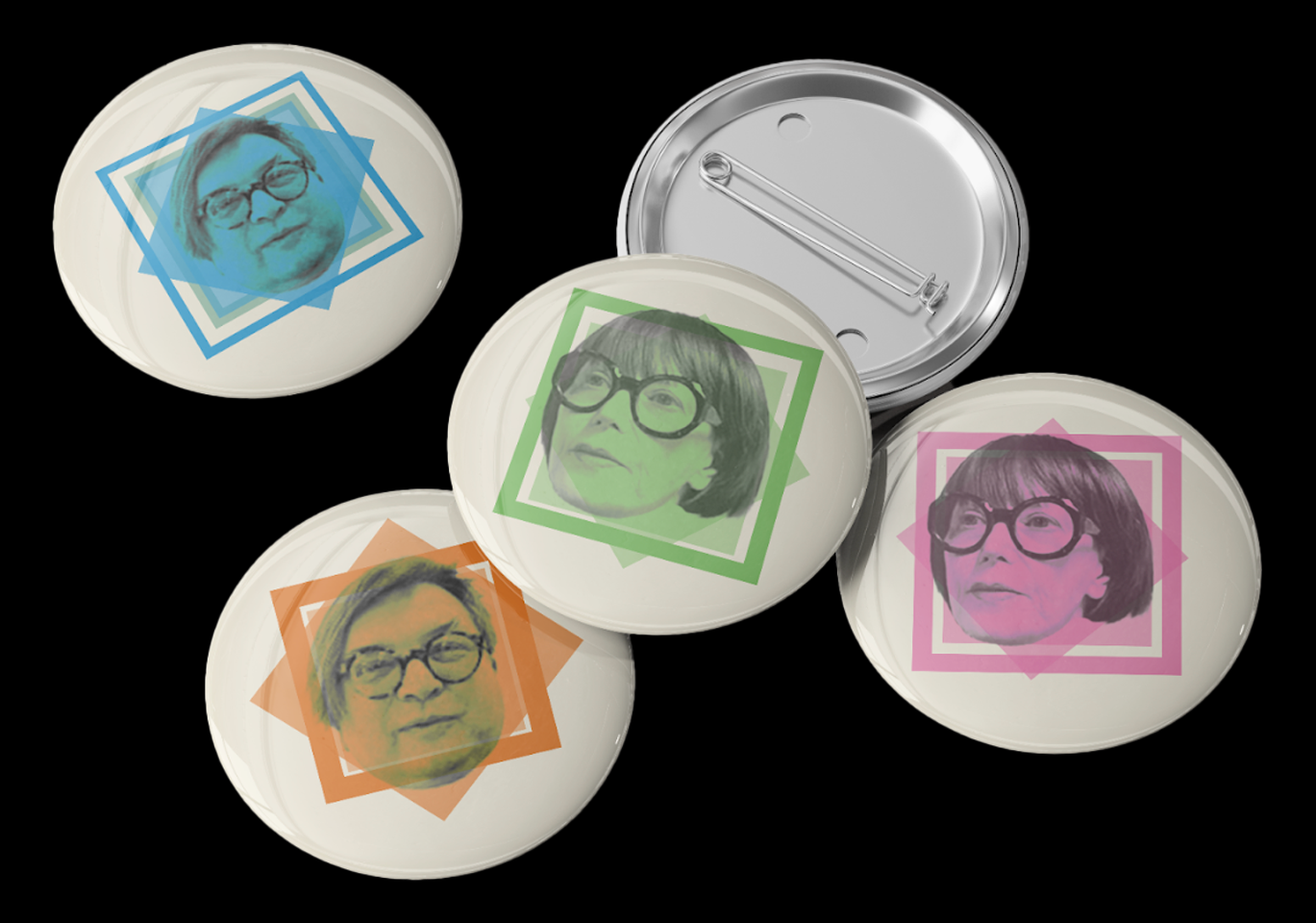
Merchandise
Created Using Adobe Photoshop and Adobe Illustrator